Communities & Health Research 

An accessible, data-rich infographic transforming public health consultation findings into clear community knowledge.
Caafi Health
Verified Partner2025
Project DurationInformation Designer & Illustrator
Lead DesignInfographic Design, Information Design, Layout Design
Strategic visual communication with heart.
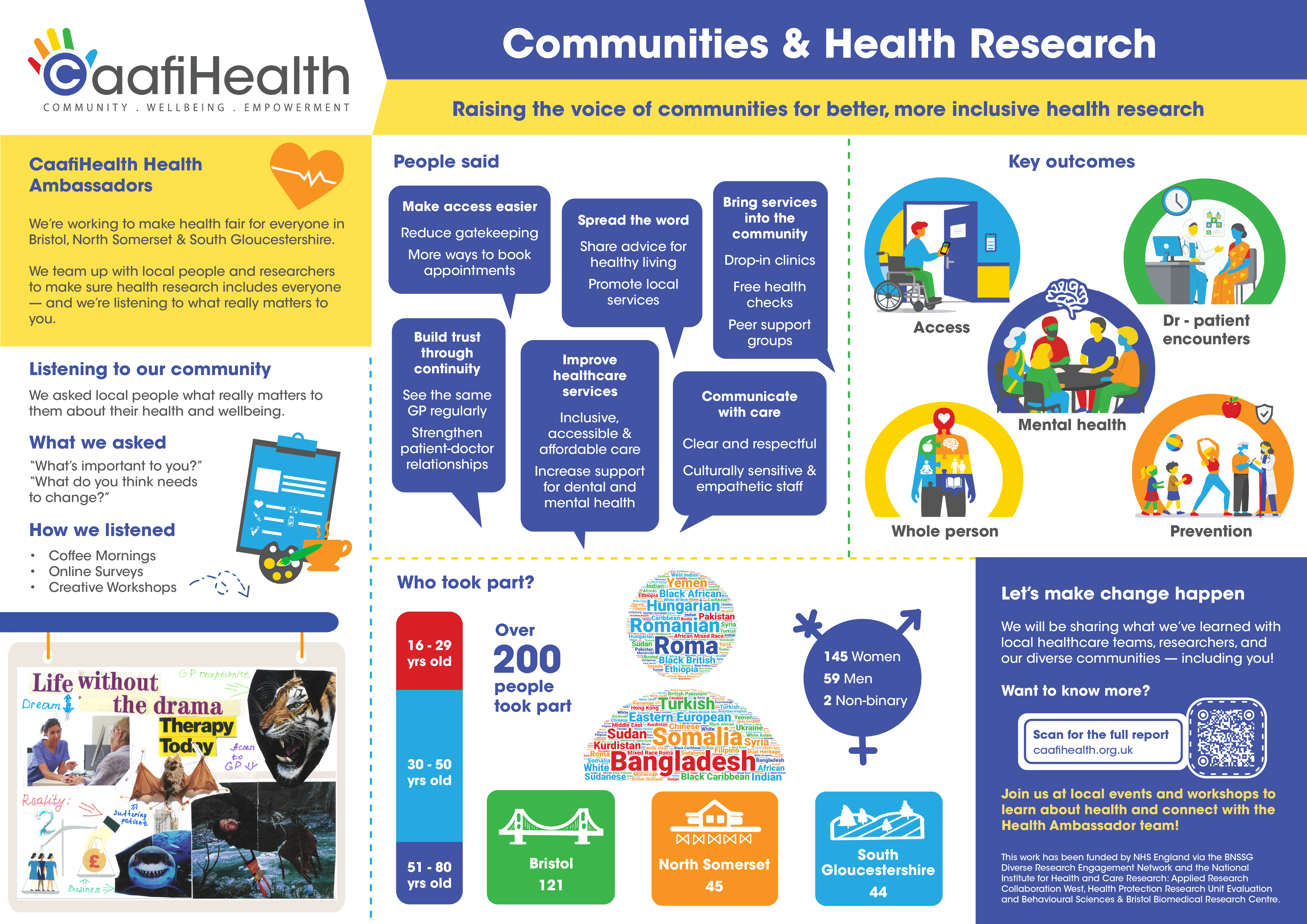
An infographic designed for Caafi Health’s Communities & Health Research project, communicating feedback from local communities across Bristol, North Somerset and South Gloucestershire. The aim was to turn research findings, participant insights and key outcomes into a clear, accessible visual summary.
Transforming vital public health data into clear, compassionate visual communication for diverse communities.Sevilay Kaya, Designer
Intentional aesthetics & thoughtful execution.
Working within Caafi Health’s established brand identity and official colour guidelines, the layout uses a structured modular grid to organise complex research data, including community feedback, health priorities, participant demographics, and NHS recommendations. Systematic colour coding derived from the client’s brand palette, paired with speech bubbles and custom icons, guides the reader effortlessly through dense qualitative and quantitative public health findings.
✦ Project DNA & Deliverables Checklist
Official Client Brand Identity Palette
7 Core Brand HuesThe colour palette is established by Caafi Health official brand guidelines. As information designer, I systematically mapped and deployed these existing healthcare brand colours across demographic data cards, clinical concern indicators, and community quotation bubbles to ensure accessible visual hierarchy.
Caafi Royal Cobalt
Client Brand Primary: Applied to core healthcare identity, headers and structural containersRadiant Solar Yellow
Client Brand Accent: Applied to key survey statistics, callouts and demographic highlightsPriority Crimson Red
Client Brand Alert: Applied to top clinical priorities and health concern indicatorsSky Cyan Blue
Client Brand Secondary: Applied to secondary research modules and metric circlesTangerine Orange
Client Brand Warmth: Applied to community participant quotes and action recommendationsVital Health Green
Client Brand Accent: Applied to positive community outcomes and preventative care dataClean Stock White
Brand Contrast Base: Applied to modular data cards for legible contrast and breathing roomDelivered Outputs
- ✓ Research Summary Infographic
- ✓ Digital Information Sheet
- ✓ Community Engagement Print Materials
- ✓ Stakeholder Presentation Graphics
Compassion & Belonging
UWE Bristol & BRAC • Editorial & Exhibition Identity
All client logos, organisation trademarks, and collaborative campaign materials remain the property of their respective owners, displayed here for archival portfolio purposes.
